B.P de Silva Inspirations: The Sapphire Crystal’s Hexagonal form

In order to capture the essence of B.P. de Silva’s reintroduction after 151 years, we opted for a modern and geometric design for the logomark. The contemporary form reflects the brand’s evolution into its 5th generation, paying homage to its founding roots while embracing a new era of innovation and progress.

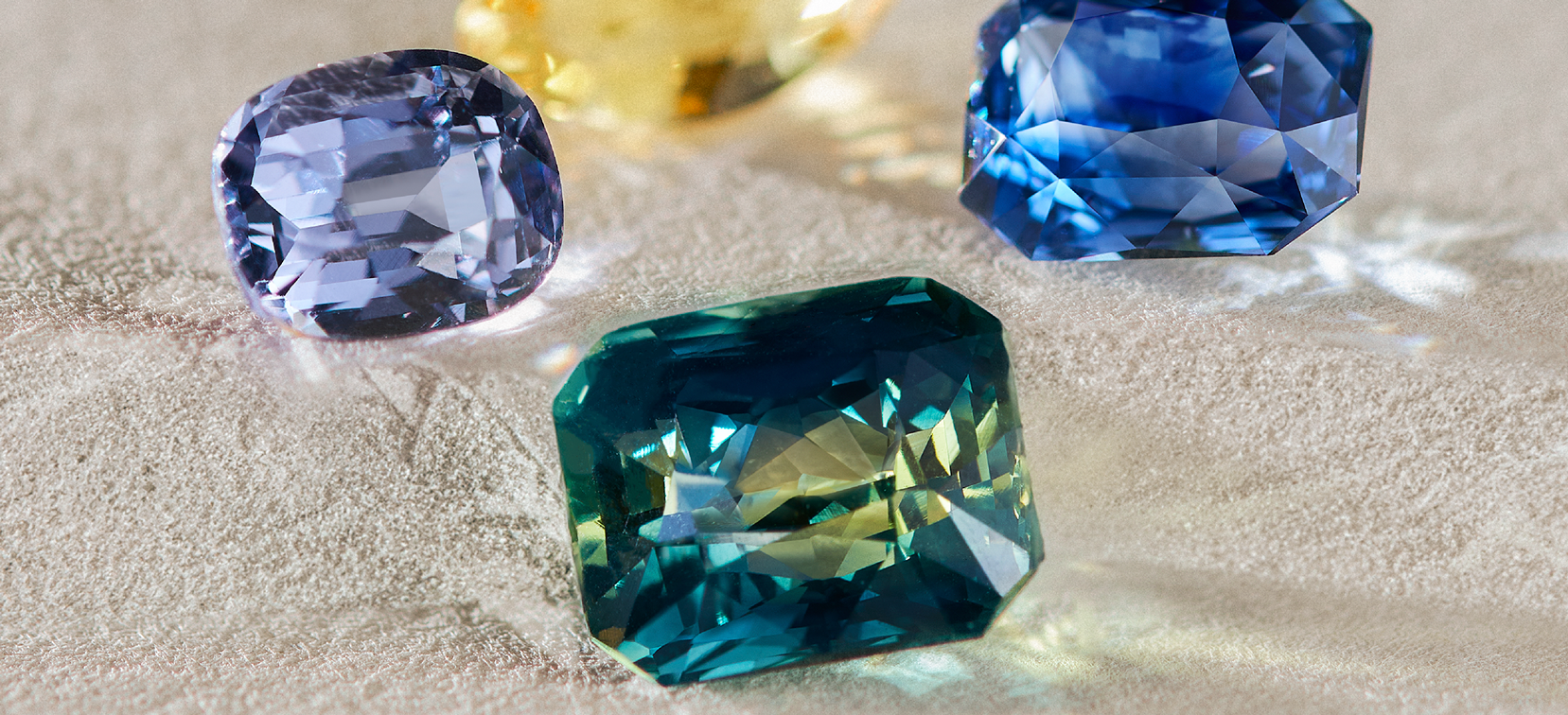
Delving deep into the crystalline structure of a Sapphire, we were inspired by the hexagonal form of this corundum. This geometric shape not only reflects the natural structure of the Sapphire, but also symbolises its stability and strength – qualities that are synonymous with our brand.

Within the logomark itself hides different gem cuts; a nod to our Founder’s story when he sailed across the Ceylon seas with a Pocketful of Gems.

Left: Our Old World Charm™ Diamond Convertible Necklace, a keepsake born of a letter that crossed sea
Right: Pocketful of Gems Diamond and Sapphire Necklace, designed in an octagonal form that is metaphorically “the building foundation” of each jewel.
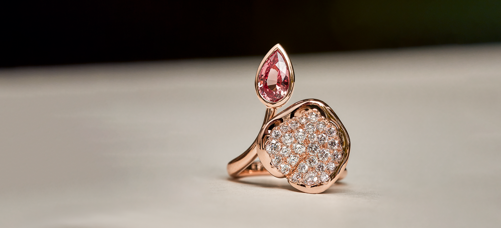
In our quest for innovative designs, the design team has incorporated elements derived from various gem cuts showcased in our distinctive logomark. These shapes serve as the cornerstone of some of our most well loved collections.